
Monday, November 28, 2011
Friday, November 25, 2011
Accent Creations - gallery page rough

When the website visitor clicks on the thumbnail on the left - the larger size image appears in the main content area. The gallery button on the left - when visitor clicks on it - flyout menu of chests, tables, chairs, desks, beds, small treasures, miscellaneous appears bringing them to another gallery page. I chose the white backdrop for the furniture/woodwork piece to allow allow the piece to shine and pop.
Accent Creations - Splash/home page roughs


The furniture pieces were selected from their backgrounds in photoshop - wanted Michael's furniture pieces to be showcased in splash/home page. The grey pattern background image suggests wallpaper & has contemporary feel to it. Also the grey color allows the furniture pieces to pop.

The background image uses Michael's furniture pieces re-worked in photoshop to get outlines. The different outlined furniture/woodwork piece can easily be re-sized or shifted in position...
Wednesday, November 23, 2011
Accent Creations - logos and company name work-ups

The font with the 3 repeating squares in letter E - I colored and the square may be used for buttons.


Statement of Intent for Accent Creations
Michael McGrath wanted an art nouveau feel to website and may incorporate letters 'A' or 'AC' for logo.
I would like the website to showcase his fine art furniture - be simple, clean and incorporate curvy, organic lines. The colors will be from nature and/or wood-like colors as that is the materials Michael works with.
SpryFloat Assignnment

Thursday, November 17, 2011
list assignment

For the button 'image' - done in illustrator - then to psd; tried solid oval - lowering capacity so type would show through on mouse over. Need to practice getting the hang of using the external style sheets - changing it out from there for individual look.
Sunday, November 13, 2011
Research: Misc websites for inspiration
http://www.instantshift.com/2011/02/25/21-beautiful-art-gallery-websites-for-inspiration/
The website shows '21 Beautiful Art Gallery Websites for Inspiration'.
The websites below are useful sources of inspiration, and they prove that there are multiple variations on similar themes which can be used when you make a website. They show the array of choices that designers have and the ways in which sophisticated, intricate, or visually interesting graphics can actually enhance the look of the art, not counteract it. By creating a balance between the work being sold and the design format, art galleries have the potential to optimize their website as a marketing tool and therefore increase their business.
I checked out a few...
http://www.luhringaugustine.com/
I like the clean look of this website - simple white/grey backgrounds so images can shine.
http://www.galeriethomasschulte.de/index_site.html
Another website that can be image driven. Again, the simple grey background to showcase the artwork.
http://www.snowdenindustries.com/portfolio_logos.html
I like the repeating circle and orange elements...
Wednesday, November 9, 2011
Research: Misc art & furniture websites


Above is Dave Jones website - I liked that when you click on the smaller rectangle image - the image as above comes up (about 6x5 inch) to give a really good look at the piece for details.

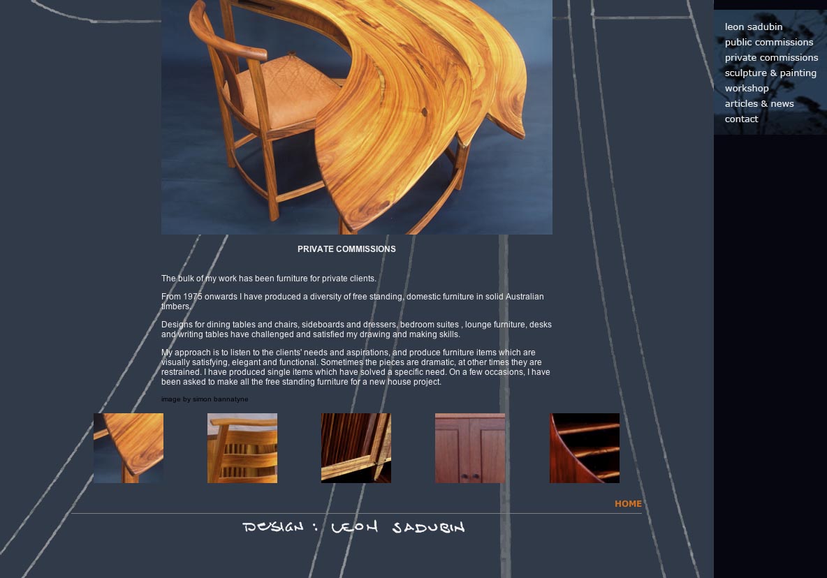
Above two images from leonsdubing website. The blue background had different lines and designs -not quite sure the blue works so well. Like the placement of the menu bar and furniture item showcased.

I like the clean look and simple lines (border) - images floated from one to another. Chajo.com

I like the simple suggestive textural lines in the background which is sort of carried through to image in front.

Luons art website of funky fun furniture is very colorful and the black really is good for colorful furniture in front.
Monday, November 7, 2011
Research: Tony Kenway furniture site
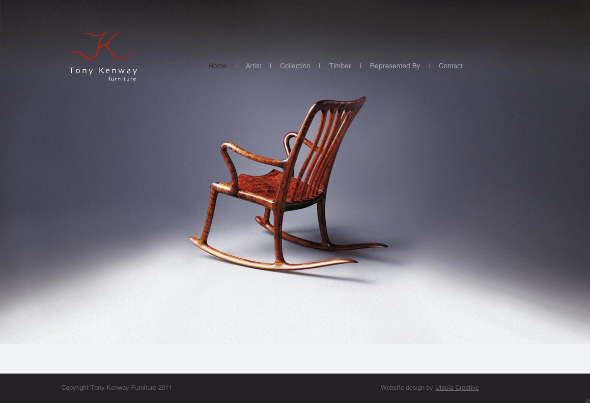

Michael thought the website is interesting - I like the simplicity of the home page. The gallery has the thumbnails - rollover to larger image - and from there and click to get an even larger image. Since Michael's work is all about fine furniture - the emphasis should probably be on the image and showcasing of the furniture.
Research for Accent Creations - Richard Vaughan site
http://richardvaughan.com.au/Gallery/Pages/Works_in_Wood.html#15
Michael like's the feel of the website - it's not a catalogue. I like the page for the thumbnails and big images below and links to previous and next.
Michael like's the feel of the website - it's not a catalogue. I like the page for the thumbnails and big images below and links to previous and next.
Research for Accent Creations - art nouveau
Art nouveau - some info...
Intl style of deco and architecture from 1880s.
Writhing plant forms
Emphasized decoration and artistic unity
Work of Beardsley
Famous guimard’s famous glass and iron metro designs
Best expressed in applied arts
Michael McGrath -contemporary fine furniture designer likes art nouveau eg for logo?
The above may give me an idea for working out the font type for a logo...


Helpful link for art nouveau designs.
Tuesday, November 1, 2011
Red - ShoeLore final two pages


Hooray - finished final 2 of 4 pages. Thanks to fellow students and prof Angela who assisted with various 'issues' with things looking different in various browsers and needing to re-do linking of menu..navigation links. Found it was a bit less frustrating with the 'insert - image object - rollover image' easier to style that way. What an eye strain staring at the code views to 'find' some tiny missing particle. Must remember to look away every 20 minutes - re-focus!
Here's link to the website. Hope it works!
http://www.palosverdes.com/roseannah/red/shoe_lore_splash.html
Subscribe to:
Posts (Atom)