Tuesday, December 13, 2011

Accent Creations: gallery - chests final


Above screen shot now has rotating gallery inserted for gallery - chests page.  Web visitor can either navigate through the page via right- left arrows on large image or click on thumbnail below to view large image.  The menu bar as shown has up-dated changes & wont have the capital letters - but upper and lower case and will be in same reddish/brown color tone as the bars- also I don't believe the grey box will be visible.

Sunday, December 11, 2011

Accent Creations: Gallery page HTML screen shot with boxes & images so far


The purple stripe is 'placeholder' for menu bar; and grey box is for rotator gallery images.  Trying to work on spry menu bar some more.  It's a lot trickier.  Help!

Accent Creations- Home/Splash page final


The colors for the font, red bars on top and bottom of page are all the same color as Mandy's file #921410 (the reddish/brown color).  When a . clicks on the AC logo - it links to the gallery page.  Website dimensions are:  1024 px  width x 768 px height.

Accent Creations - background image for gallery pages


I worked on this background image for gallery pages; logo for top left side & menu bar to be worked in as spry horizontal menu bar with drop-down sub-menus.  I struggled and struggled till late into night to plug in  Mandy's images for AC & wood and it worked once or so in preview but then no more.

Friday, December 9, 2011

Accent Creations - gallery chests page

http://www.palosverdes.com/roseannah/galleryChests.html

I just put in white background and resized images to 800 width x 595 height
I adjusted the border to grey vs the darker color to allow the images to be main focus.  This page has missing elements.    Pages will eventually have Michael's own domain & URL address.

Wednesday, December 7, 2011

gallery rough

accent creations - splash/home page roughs


Michael - this is the proposed splash/home page - website visitor would click on the 'AC' logo to go the gallery (sub-menu has chest, miscellaneous, tables, small treasures, chairs drop down) page  with rotating gallery & thumbnails (name of item and description below larger image.

Sunday, December 4, 2011

Accent Creations - splash/homepage rough


Incorporated Mandy's logo - and similar look to her other recently created pages.  Web visitor would click to enter to view menu options.  Not sure if Michael wants to put any info for footer??

Thursday, December 1, 2011

Accent Creations - Splash page rough up-date


I wanted to keep splash/home page simple - incorporated Mandy's logo -color can be changed very easily.

Friday, November 25, 2011

Accent Creations - gallery page rough


When the website visitor clicks on the thumbnail on the left - the larger size image appears in the main content area.  The gallery button on the left - when visitor clicks on it - flyout menu of chests, tables, chairs,  desks, beds, small treasures, miscellaneous appears bringing them to another gallery page.  I chose the white backdrop for the furniture/woodwork piece to allow allow the piece to shine and pop.

Accent Creations - Splash/home page roughs

The image used is art nouveau design 'Grand Palais' in Paris, France.  Image re-worked in photoshop. I wanted to give sense of curves and welcoming open arch/doorway feel to website visitor.


The furniture pieces were selected from their backgrounds in photoshop - wanted Michael's furniture pieces to be showcased in splash/home page.  The grey pattern background image suggests wallpaper & has contemporary feel to it.  Also the grey color allows the furniture pieces to pop.


The background image uses Michael's furniture pieces re-worked in photoshop to get outlines.  The different outlined furniture/woodwork piece can easily be re-sized or shifted in position...


Wednesday, November 23, 2011

Accent Creations - logos and company name work-ups

The above fonts are 'free' fonts except helvetica attached to complete the company name.  I used the circle in a couple logos thinking I could incorporate the circle as a repeating element for buttons to link pages...
The font with the 3 repeating squares in letter E - I colored and the square may be used for buttons.

Accent Creations - wireframe and site map architecture


Statement of Intent for Accent Creations

Michael McGrath wanted an art nouveau feel to website and may incorporate letters 'A' or 'AC' for logo.
I would like the website to showcase his fine art furniture - be simple, clean and incorporate curvy, organic lines.  The colors will be from nature and/or wood-like colors as that is the materials Michael works with.  

SpryFloat Assignnment

Do the math to figure out widths...for the 3 columns in content box (columns are floated); and there is clear float .css style in code b4 footer box.  The spry menu bar color is changed from default eg try search customize menu bar widget.  

Thursday, November 17, 2011

list assignment


For the button 'image' - done in illustrator - then to psd; tried solid oval - lowering capacity so type would show through on mouse over.  Need to practice getting the hang of using the external style sheets - changing it out from there for individual look.

Sunday, November 13, 2011

Research: Misc websites for inspiration

http://www.instantshift.com/2011/02/25/21-beautiful-art-gallery-websites-for-inspiration/
The website shows '21 Beautiful Art Gallery Websites for Inspiration'.
The websites below are useful sources of inspiration, and they prove that there are multiple variations on similar themes which can be used when you make a website. They show the array of choices that designers have and the ways in which sophisticated, intricate, or visually interesting graphics can actually enhance the look of the art, not counteract it. By creating a balance between the work being sold and the design format, art galleries have the potential to optimize their website as a marketing tool and therefore increase their business.
I checked out a few...


http://www.luhringaugustine.com/
I like the clean look of this website - simple white/grey backgrounds so images can shine.

http://www.galeriethomasschulte.de/index_site.html

Another website that can be image driven.  Again, the simple grey background to showcase the artwork.

http://www.snowdenindustries.com/portfolio_logos.html

I like the repeating circle and orange elements...

Wednesday, November 9, 2011

Research: Misc art & furniture websites


Above is Dave Jones website - I liked that when you click on the smaller rectangle image - the image as above comes up (about 6x5 inch) to give a really good look at the piece for details.


Above two images from leonsdubing website.  The blue background had different lines and designs -not quite sure the blue works so well.  Like the placement of the menu bar and furniture item showcased.


I like the clean look and simple lines (border) - images floated from one to another. Chajo.com


I like the simple suggestive textural lines in the background which is sort of carried through to image in front.


Luons art website of funky fun furniture is very colorful and the black really is good for colorful furniture in front.

Monday, November 7, 2011

Research for Accent Creations - links Michael likes

http://www.bwoodworks.com.au/node/160


Research: Tony Kenway furniture site


Michael thought the website is interesting - I like the simplicity of the home page.  The gallery has the thumbnails - rollover to larger image - and from there and click to get an even larger image.  Since Michael's work is all about fine furniture - the emphasis should probably be on the image and showcasing of the furniture.

Research for Accent Creations - Richard Vaughan site

http://richardvaughan.com.au/Gallery/Pages/Works_in_Wood.html#15

Michael like's the feel of the website - it's not a catalogue.  I like the page for the thumbnails and big images below and links to previous and next.

Research for Accent Creations - art nouveau


Art nouveau - some info...

Intl style of deco and architecture from 1880s.
Writhing plant forms
Emphasized decoration and artistic unity
 Associated with arts and crafts ideas
 Design work of macDonald sisters
Work of Beardsley
Famous guimard’s famous glass and iron metro designs
Best expressed in applied arts 


Michael McGrath -contemporary fine furniture designer likes art nouveau eg for logo?

The above may give me an idea for working out the font type for a logo...


Helpful link for art nouveau designs.

Tuesday, November 1, 2011

Red - ShoeLore final two pages


Hooray - finished final 2 of 4 pages.  Thanks to fellow students and prof Angela who assisted with various 'issues' with things looking different in various browsers and needing to re-do linking of menu..navigation links.  Found it was a bit less frustrating with the 'insert - image object - rollover image'  easier to style that way.  What an eye strain staring at the code views to 'find' some tiny missing particle.  Must remember to look away every 20 minutes - re-focus!

Here's link to the website.  Hope it works!
http://www.palosverdes.com/roseannah/red/shoe_lore_splash.html

Wednesday, October 26, 2011

Oh no! Cross browser problem.

I was going along happily working on 3rd web page and things are looking pretty good  - till I noticed tonight that my page that looked so good in Safari has a couple of the bottom info boxes all 'out of alignment' and looking wonky in Opera and Firefox.  Angela was sooo kind to help me load that up on my Mac today.  Started Google searching and found there is a code validator that supposedly checks on potential problems?  Splash and lotus shoes did not present any red flags....hmmmm....so what could be the problem?

Here's link to what was validated.
http://jigsaw.w3.org/css-validator/validator?uri=http%3A%2F%2Fwww.palosverdes.com%2Froseannah%2Fred%2Flotus_shoe.html&profile=css21&usermedium=all&warning=1&vextwarning=&lang=en

Need to check on 3rd page to see if that code checks out.  It does, but I believe I'm still having problems with how it looks in Firefox.

http://jigsaw.w3.org/css-validator/validator?uri=http%3A%2F%2Fwww.palosverdes.com%2Froseannah%2Fred%2FThe_Red_Shoe.html&profile=css21&usermedium=all&warning=1&vextwarning= or http://jigsaw.w3.org/css-validator/check/referer (for HTML/XML document only)

Friday, October 21, 2011

Red - Lotus Shoe Roughs

This will be 1st page after splash/home page.  After Prof Angela's input - I'm trying to limit the written info to key points and give web visitor links for pursuing more details.  The photo will link to page to include other photos.
I think I like this version better the warm/cool colors seem more dynamic.  I will start laying out my boxes.  Finally!  NO more roughs.

Thursday, October 20, 2011

Red - More Shoe Lore roughs

Prof Angela viewed this rough yesterday and did not seem too pleased.   Seems like it reads too much like print vs web where we need to capture viewer's attention quickly.  What!  They don't like to read this most interesting material???  The vertical bars is ok.  Maybe bigger 'Lotus Shoes' header.

I think the bigger font size which matches the splash page looks more interesting.  I added the red h1 and worked with the leading in the body type per Angela's suggestion.  Is it back to the drawing board to make yet another rough??  I NEED to start making my container boxes...

Wednesday, October 19, 2011

Boxes - Absolute & Fixed Re-do


<!DOCTYPE html PUBLIC "-//W3C//DTD XHTML 1.0 Transitional//EN" "http://www.w3.org/TR/xhtml1/DTD/xhtml1-transitional.dtd">
<html xmlns="http://www.w3.org/1999/xhtml">
<head>
<meta http-equiv="Content-Type" content="text/html; charset=UTF-8" />
<title>absoluteBox</title>
<style type="text/css">
<!--
.bigBox 
{
 background-color: #FFFF99;
 height: 600px;
 width: 600px;
 left: 50px;
 top: 50px;
 position: absolute;
}

.middleBox
 {
 background-color: #FF9933;
 height: 400px;
 width: 400px;
 position: absolute;
 top: 100px;
 left: 100px;
}

.smBox 
{
 background-color: #CC0000;
 height: 50px;
 width: 50px;
 top: 160px;
 position: absolute;
 left: 160px;
}

.bigBox2
 {
 background-color: #FF3333;
 height: 600px;
 width: 600px;
 position: fixed;
 margin-left: 1000px;
 margin-top: 50px;
}

.middleBox2 
{
 position: fixed;
 height: 400px;
 width: 400px;
 background-color: #FFFF66;
 left: 1100px;
 top: 150px;
}

.smBox2
 {
 position: fixed;
 height: 50px;
 width: 50px;
 background-color: #FF9900;
 top: 300px;
 left: 1250px;
}
-->

</style>
</head>

<body>


<div class="bigBox2"></div>
<div class="middleBox2"></div>
<div class="smBox2"></div>

<!--need to select from code and move to inside big box div class to be in the box-->


<div class="bigBox">
<div class="middleBox">
<div class="smBox"></div>
</div>
</div>
</body>
</html>

Monday, October 17, 2011

Wireframe & Site Architecture


The green marker outlines the wireframe and the blue marker indicates six information architecture layouts.  Refer to write up with more specifics for info architecture in earlier post.

Tuesday, October 11, 2011

Red - Shoe Lore roughs

This rough for my 'splash' home page is 'boring' says Angela.  She also said each word or so would need it's own box to enable client to change things around more easily.

This rough for 'splash' home page met with more approval from Angela & I was able to work out the header and tagline in Dreamweaver.   The header 'ShoeLore' along with the strip behind it was worked in psd and saved as png to allow for transparent area behind strip  (Yea!  Now, how to work out the menu (do as links??  rollovers??)

Websites - may consider for inspiration

http://www.hopeunlimited.org/fiveforten.html


I like the simplicity of this home page.  Simple layout - the menu bar - scrolls horizontally.  The place holder for the web pages has consistent jagged edges look.


The above website is recognized for it's design.  Great use of colors.  KISS!


Check out the above link for some cool (flash?) - she has links to other 'good' websites.


Red website: info architecture

Shoe Lore - tagline: Oh, the tales shoes can tell

Goal:  Inform re: shoes and the cultural ramifications from three different time periods and includes three cultures.   Beauty & it's requirements of women through the ages seems to run through history. Red is  color - because it incorporates ideas of pain, blood, sexuality, lust, desire

Present info in simple, well-designed pages which show consistent elements throughout.   Learn how to use CSS boxes to include elements for pages.

Audience:  students in web design class; general public

Content & Functionality  (May omit one of the pages)

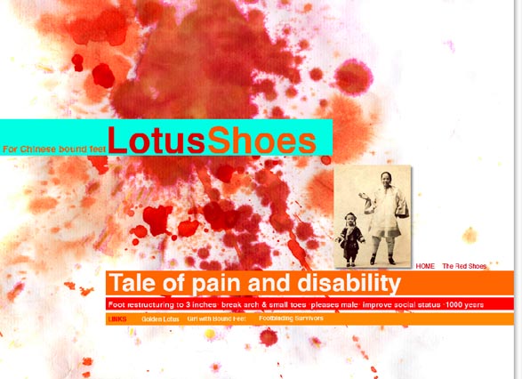
Home/ splash page - with keywords from articles eg pain, foot binding, disability, hammer toe, bunions, foot restructuring, 1000 years, sexy, lust

  OR    plain white bkgnd with image of blood splats/drops with "Shoe Lore" and tagline and text for linking to 3-4 other pages:

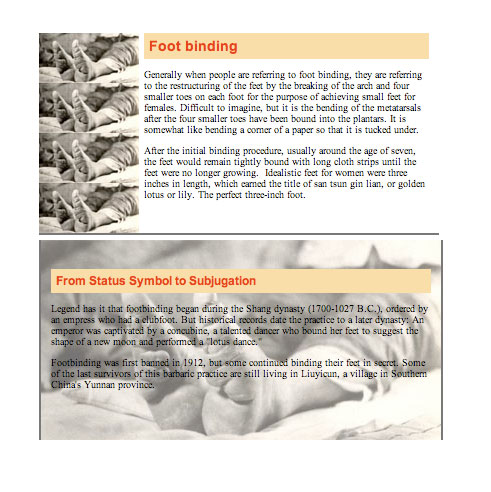
Bound feet/ Lotus shoes - China: who, why, when  tiny 3-4" shoes worn.  
Thumbnail - roll over/link  for larger image of woman with bound feet wearing shoes & another of                     lotus shoes.  Might include image of damage done to foot from foot binding.  
Links to articles of how feet were bound; women who have tiny disabled feet.

The Red Shoes - Hans Christian Andersen  (who, why, when - significance of these Red Shoes for the period)
Thumbnail - roll over/link for larger image(s) of woman with red shoes, possibly dancing; http://andrewfinnie.blogspot.com/2011/06/swept-away.html  (did illustrations for tale of feet being amputated off the little girl - yikes!)
Links to articles/site  ; link to the fairy tale.  
Christian Louboutin red soles high heels eg $900!!  Eek.  Who, what, why - cultural significance of these high-end shoes - contemporary period
Thumbnail - roll over for larger image signature red soled high heels. Include image of woman wearing his high heels
Links to articles /infoof how feet are negatively impacted eg from podiatrist viewpoint.    Link to women who wear his shoes & their comments eg yahoo site.  Link to  article about negative impact on health from wearing high heels...  Link to USA article on not recommended footwear.


Dorothy in Wizard of Oz's ruby red slippers: who, when, why - it was worn.  
Thumbnail - roll over for larger image of ruby red slippers.  Might include image of Dorothy wearing ruby red slippers.
Links to articles/info about significance of ruby red slippers.


Saturday, October 8, 2011

Two boxes with text & image

Making the boxes to specifications is sort of fun, especially when it works.  Little pieces are starting to fall into place.

Try clicking on above link to see if it takes you to my website to view.


Wednesday, October 5, 2011

Got permission to use illustrations from digital artist Andrew Finnie!

I was SOOO excited to get a response from digital artist Andrew Finnie who hails from Australia!  For my red - "Shoe Lore" website he did wonderful illustrations for "The Red Shoes."  Gruesome fairy tale from Hans Christian Anderson.

Refer to his 'permission' via comment he made on my blog posted Sept 29 "These Boxes Are Pretty..."
http://andrewfinnie.blogspot.com/2011/06/swept-away.html?showComment=1317847086789#c2494484357967481653

Thursday, September 29, 2011

These boxes are pretty - absolutely and with fixed attention - ha!


<!DOCTYPE html PUBLIC "-//W3C//DTD XHTML 1.0 Transitional//EN" "http://www.w3.org/TR/xhtml1/DTD/xhtml1-transitional.dtd">
<html xmlns="http://www.w3.org/1999/xhtml">
<head>
<meta http-equiv="Content-Type" content="text/html; charset=UTF-8" />
<title>absoluteBox</title>
<style type="text/css">
<!--
.bigBox {
background-color: #FFFF99;
height: 600px;
width: 800px;
left: 50px;
top: 50px;
position: absolute;
}
.middleBox {
background-color: #FF9933;
height: 300px;
width: 400px;
position: absolute;
top: 150px;
left: 200px;
}
.smBox {
background-color: #CC0000;
height: 50px;
width: 50px;
top: 125px;
position: absolute;
left: 125px;
}
.bigBox2 {
background-color: #FF3333;
height: 400px;
width: 400px;
position: fixed;
margin-left: 1000px;
margin-top: 50px;
}
.middleBox2 {
position: fixed;
height: 300px;
width: 300px;
background-color: #FFFF66;
margin-top: 100px;
margin-left: 1050px;
}
.smBox2 {
position: fixed;
height: 100px;
width: 200px;
background-color: #FF9900;
margin-left: 1075px;
margin-top: 200px;
}
-->
</style>
</head>

<body>


<div class="bigBox2"></div>


<div class="middleBox2"></div>
<div class="smBox2"></div>

<!--need to select from code and move to inside big box div class to be in the box-->


<div class="bigBox"><div class="middleBox"><div class="smBox"></div>
</div>
</div>
</body>
</html>

http://www.palosverdes.com/roseannah/red/absoluteBox.html
I wonder if this link will bring me to website to view.....???